West Plains Engineering was built on values that still guide us today—hard work, integrity, and trust. We’re proud to share a new logo that embraces those roots while reinforcing our commitment to progress. It keeps our familiar WPE monogram, honoring our legacy, while leaning into the future with a bold, modern design that represents our purpose.

Watch Our Logo Come to Life

Explore the Design
Read Our Brand Story
West Plains Engineering was imagined, designed, and built right here in the heart of America. In this area, agriculture and industry are king, creating a community that’s proud of its core values – hard work, integrity, honesty, and trust.
Our founders embodied these same values and instilled them in our firm. They believed in people too. Not just the people on the payroll, but an entire community working together, relying on one another, and supporting each other to get the job done right. While that might seem like a cliché, in an industry rooted in specifications, standards, rates, and contracts – making personal relationships part of the equation, is unique.
Today, the West Plains region and our firm have grown and changed. But the core values that make us who we are, remain constant.
We believe our logo should reflect that—telling our story as it was, as it is, and as we envision it for the future.
Our updated logo is more than a visual refresh—it’s a reflection of who we are, where we come from, and where we’re headed.
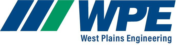
At its core, the design retains the original WPE monogram, preserving the brand equity we’ve built over decades. This familiar mark honors our legacy while setting the stage for what’s next.
The stacked structure draws the eye to “WPE,” reinforcing how our brand is perceived—strong, recognizable, and rooted in engineering excellence. The full name, “West Plains Engineering,” is included as a secondary element. It’s present, but not the focus—just like our work: quietly powerful, always dependable.
Three distinct bars anchor the design. They represent the three letters of our monogram and symbolize our roots in the plains. The blue bars stand for “WP”—who we are: trustworthy, confident, and dependable. The green bar represents “E”—what we do: engineering for growth, renewal, and sustainability. Together, they tell a story of identity and purpose.
These bars lean forward, a subtle nod to the slant of our traditional logo and italicized type. But more importantly, they represent our commitment to progress, innovation, and efficiency. We don’t stand still—we lean into change.
This logo isn’t just a mark. It’s a message. A symbol of our past, present, and future—designed to move with us as we continue to build, innovate, and lead.
WPE is who we are. Engineering is what we do. And change is how we grow.